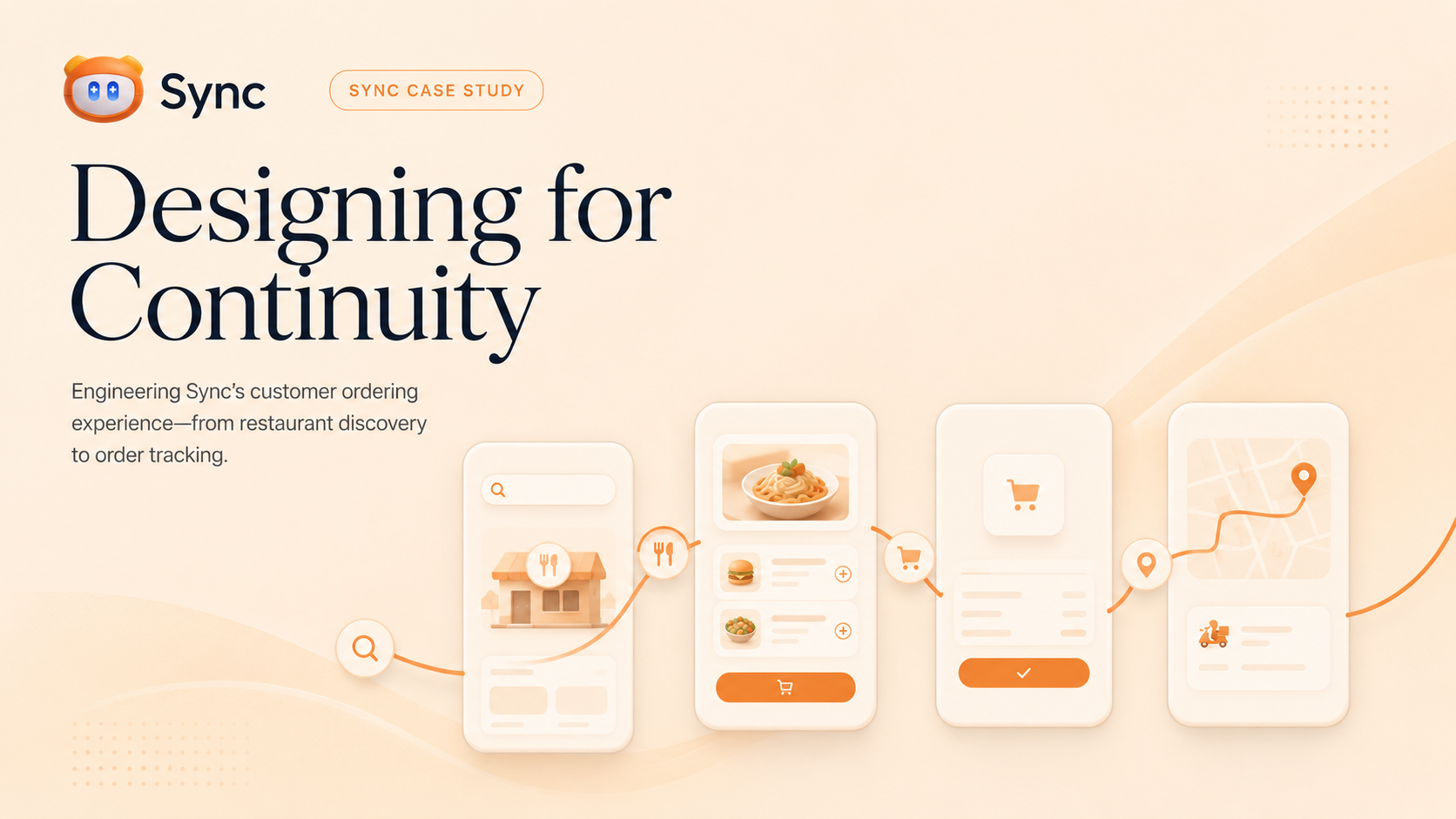
The work
A complete ordering experience, engineered as one product.
A restaurant-ordering experience appears simple from the outside: find a restaurant, choose something to eat, and place an order.
Behind that simplicity is a much harder product problem.
The interface must understand whether a restaurant is available, whether it delivers to the customer’s address, which fulfillment methods are active, what currency the order uses, which products can be customized, and what should happen when the backend rejects an order. It must also keep the customer oriented as they move between discovery, checkout, confirmation, tracking, order history, and their account.
We set out to engineer that complete experience for Sync. This was not approached as a collection of screens or a traditional before-and-after redesign. The goal was to make the customer side of Sync feel like one continuous product, from the first restaurant search to the final order update.
The resulting work covered restaurant discovery, menus, product and offer details, fulfillment, cart and checkout, delivery addresses, confirmation, tracking, Orders, Profile, authentication, and rating.
A coherent experience is not one where every screen looks identical. It is one where every step tells the same truth.
01 · The first problem
The first problem was not visual.
The work began around restaurant discovery, where an interface can only be as honest as the operating data beneath it.
Sync’s landing page and restaurant-management tools already had a recognizable identity: warm surfaces, editorial typography, rounded controls, restrained elevation, and orange accents. The customer listing did not yet feel connected to that system.
Restaurant cards placed names, operational information, delivery details, minimum orders, and distance directly over photography. The result could look dramatic, but it was harder to scan, particularly when the underlying image was visually busy.
But before redesigning the cards, we found a more fundamental problem. The restaurant API could return opening hours as an array of daily records. The customer application expected only a day-keyed object. A restaurant could therefore be returned successfully by the API and still fail to render in the interface.
The model was updated to accept both supported opening-hours formats and the time aliases already used by the discovery endpoint. Invalid entries could be ignored safely instead of causing the complete listing to fail.
This pattern continued throughout the project. Whenever visual polish conflicted with authoritative data, the data won.
02 · One journey
Designing the journey as one product.
Each stage has its own requirements, but none of them can feel isolated from the stage before it.
We mapped the customer experience as a continuous sequence:
- 01Discover
- 02Restaurant
- 03Product
- 04Fulfillment
- 05Checkout
- 06Confirmation
- 07Tracking
Discovering the right restaurant
Restaurant discovery needed to answer practical questions quickly: Which restaurants are available? Which ones deliver to my location? Are they open now? What will delivery cost? Is there a minimum order? How far away are they?
Photography remained prominent because food and restaurant identity are inherently visual. Operational information, however, moved into a separate readable surface rather than competing with the image.
Restaurants disabled at either the restaurant level or their public-listing level were removed from discovery entirely. Restaurants that were temporarily closed but still available remained visible and could communicate their next opening state.
This distinction mattered. “Closed right now” and “not accepting customers through Sync” are not the same condition, and the interface should not pretend that they are.
Understanding the restaurant
Opening a restaurant needed to feel like a continuation of discovery, not a transition into another application. The restaurant page established identity first: cover imagery, logo, availability, ordering modes, and essential operational details.
Search was redesigned as a complete, escapable state rather than a mostly blank overlay that changed behavior after the customer began typing. The previous sequence of many expanded category sections was replaced with a focused category selector. Only the selected category’s products were built and presented, preventing the menu from becoming an unnecessarily long page.
Menu items used image-led rows with clear product information and distinct actions for viewing details or adding to the cart. Products that were unavailable stayed visible but were clearly disabled rather than appearing actionable.
03 · From choice to order
Make a decision, then make it valid.
Product detail and checkout must represent the same information that eventually enters the cart and reaches the restaurant.
Making a product decision
Products could include descriptions, ingredients, additions, removals, notes, quantity, discounts, and calorie information. These options were presented in one continuous experience instead of splitting customization across competing layers.
Calories appeared only when an authoritative positive value existed. The interface no longer inferred calorie information from unrelated preparation data or displayed a default value.
Offers received the same treatment. Placeholder images, hard-coded product rows, and invented marketing claims were removed. An offer now displayed its real included products and created a real cart offer using the same restaurant-boundary protections as individual items.
The interface could still be persuasive, but it could not fabricate information to achieve that.
Turning intent into a valid order
Checkout is where a polished customer experience meets operational reality. Customers may need to select delivery or in-restaurant ordering, choose an address or table, provide a phone number, authenticate, edit product customizations, and resolve validation problems before an order can be accepted.
The fulfillment selector was simplified into one compact surface rather than two oversized competing cards. Cart editing, order notes, pricing, saved addresses, and the final action were brought into one readable flow, with a wider two-column layout used when enough screen space was available.
Technical fulfillment failures were translated into localized customer guidance. Backend field names, internal exception messages, and validation structures were not exposed directly in the checkout interface.
04 · After checkout
Trust does not end when an order is submitted.
Confirmation, tracking, order history, and Profile need to remain part of the same customer-facing product.
Confirmation presented one clear summary and one continuous receipt using the real restaurant identity, fulfillment method, products, customizations, charges, taxes, currency, and final total.
Order tracking remained within the customer-facing Sync product. It no longer transferred customers to the restaurant-partner interface, and shared tracking routes did not place customer phone numbers inside the URL.
Orders, order details, rating, cancellation, and Profile were then brought into the same journey. A customer could move from a restaurant to an order, from an order notification to its details, or from Profile to their history without encountering a new navigation model each time.
Consistency without sameness
The customer experience borrowed from Sync’s restaurant-management design language: warm cream backgrounds, orange accents, editorial headings, soft translucent surfaces, restrained elevation, rounded controls, and tactile press and hover responses.
It did not copy the admin interface literally. Restaurant discovery needed to remain image-led and emotionally inviting. Checkout needed to prioritize clarity and confidence. Order tracking needed to emphasize progress. Profile needed to feel personal without inventing avatar data.
That difference became especially clear during the restaurant-page redesign. The first design pass placed too many sections inside elevated white surfaces. Although the individual components were consistent, the complete page felt like a wall of widgets.
We reduced the containment: announcements became editorial strips, ambiance became an image collage, product cards became open rows separated by subtle rules, and secondary metadata was allowed to sit naturally in the layout.
A design system should create relationships between elements, not force every element into the same container.
05 · Behind the screens
Continuity lives behind the screens.
Several of the most important improvements were barely visible, but they were the infrastructure that allowed the visual experience to remain believable.
The original address experience existed in different forms depending on where the customer entered it. Homepage location, Profile addresses, and checkout could drift in behavior.
These were consolidated around one shared address form and a canonical full-page editor. Signed-in customers selected real server-backed addresses, while temporary local address identifiers remained limited to the explicit guest flow.
A successful address creation also used a stable request identity so a retry after a lost response would not silently create duplicates.
Navigation needed structural work too. Static routes such as /order-details, /rating, cart, and other customer pages originally competed with a catch-all restaurant route. In some cases, the router interpreted a path such as /order-details or /rating as though it were a restaurant identifier.
Static customer routes were moved ahead of the restaurant route while valid restaurant deep links remained supported. Back behavior was standardized using a pop-or-fallback rule. Direct links, browser refreshes, and normal in-app navigation could then return customers to a predictable destination instead of relying on hard-coded routes.
06 · Language and performance
Designing Arabic and English together.
Arabic was not treated as a translated version of the English interface.
The customer design system used separate typography roles for each language. English used Outfit for interface text and Playfair Display for selected editorial headings, while Arabic used its own distinct, legible type role.
Direction affected more than text alignment. It influenced the position of Back and Forward actions, arrow direction, control order, carousel movement, card affordances, search behavior, and mixed-language campaign and product content.
Material icons were allowed to mirror semantically with text direction instead of being manually replaced for Arabic. This avoided double-mirroring, where an icon could move to the correct side of the screen but point in the wrong direction.
English restaurant or campaign copy could also remain left-to-right inside an Arabic route while the surrounding navigation stayed right-to-left. That prevented punctuation, truncation, and ellipses from appearing on the wrong edge.
Motion followed the same accessibility standard. Entrance effects, hover, press feedback, carousel animation, parallax, and image fades resolved immediately when the platform requested reduced motion. Automatic carousel advancement was disabled in that mode as well.
Keeping the experience responsive
A coherent journey still fails if it feels heavy. The restaurant listing retained its lazy CustomScrollView and sliver-based structure rather than being rebuilt as one eager page-sized column. Restaurant cards continued to be constructed only when needed.
Image decoding was bounded near the rendered size. Key campaign artwork and the first restaurant rows were warmed after the first frame in small batches, allowing the interface to prepare upcoming content without making the initial frame compete with additional work.
Press interactions relied on transforms rather than triggering layout changes. Dominant image colors were extracted from small cached samples instead of repeatedly scanning full-resolution covers.
These were performance-conscious decisions, but we deliberately avoided claiming that performance improved without a comparable measurement from the same device and build mode.
07 · What was verified
Verification without pretending everything was perfect.
The result should distinguish what was designed, implemented, tested, and deployed from what still requires production usage and post-release measurement.
The final delivery suite passed 44 focused checks covering navigation, cancellation, availability, dialogs, customer design components, cart behavior, menu and product experiences, order details, addresses, phone handling, restaurant visibility, and operational footers.
A release-mode Flutter web build completed successfully, and the exact source revision was deployed and verified through its live release marker. The journey was also exercised in real browser sessions across English and Arabic, including discovery, restaurant access, menus, Profile, phone capture, Orders, order details, addresses, fulfillment, confirmation, tracking, and rating states.
The complete repository test suite still contained eight unrelated pre-existing failures. Those remained documented instead of being hidden or represented as migration regressions.
We can therefore say what was designed, implemented, tested, and deployed. We cannot yet say that engagement increased, restaurant-card click-through improved, or customers completed more orders. Those conclusions require production usage and post-release measurement.